BRANDING +2025
KARAI RAMEN
01 — WHAT WAS THE IDEA?
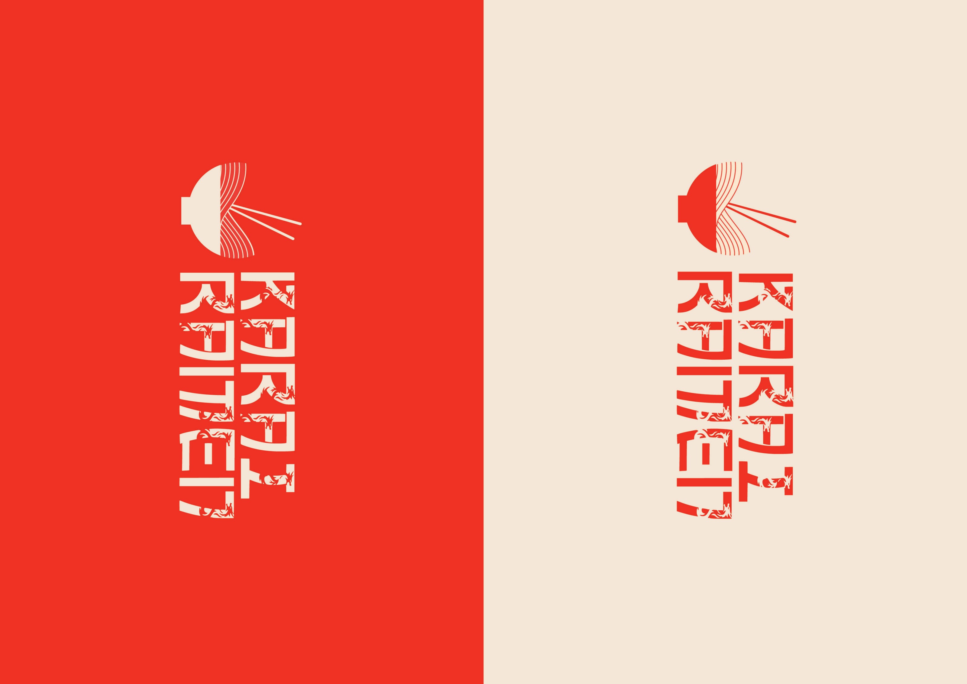
One mark that reads as a bowl from far away and a dragon up close.
02
THE START
Brief: a loud, young ramen bar. Research into Japanese sign painting, chopstick sleeves and street-level signage.
dragon = noodlestest at 2cmsticker sheet is the best merch
03
MAKING IT
Dozens of logo sketches. The dragon kept fighting the bowl until I let the noodles become the dragon.
04
THE DESIGN
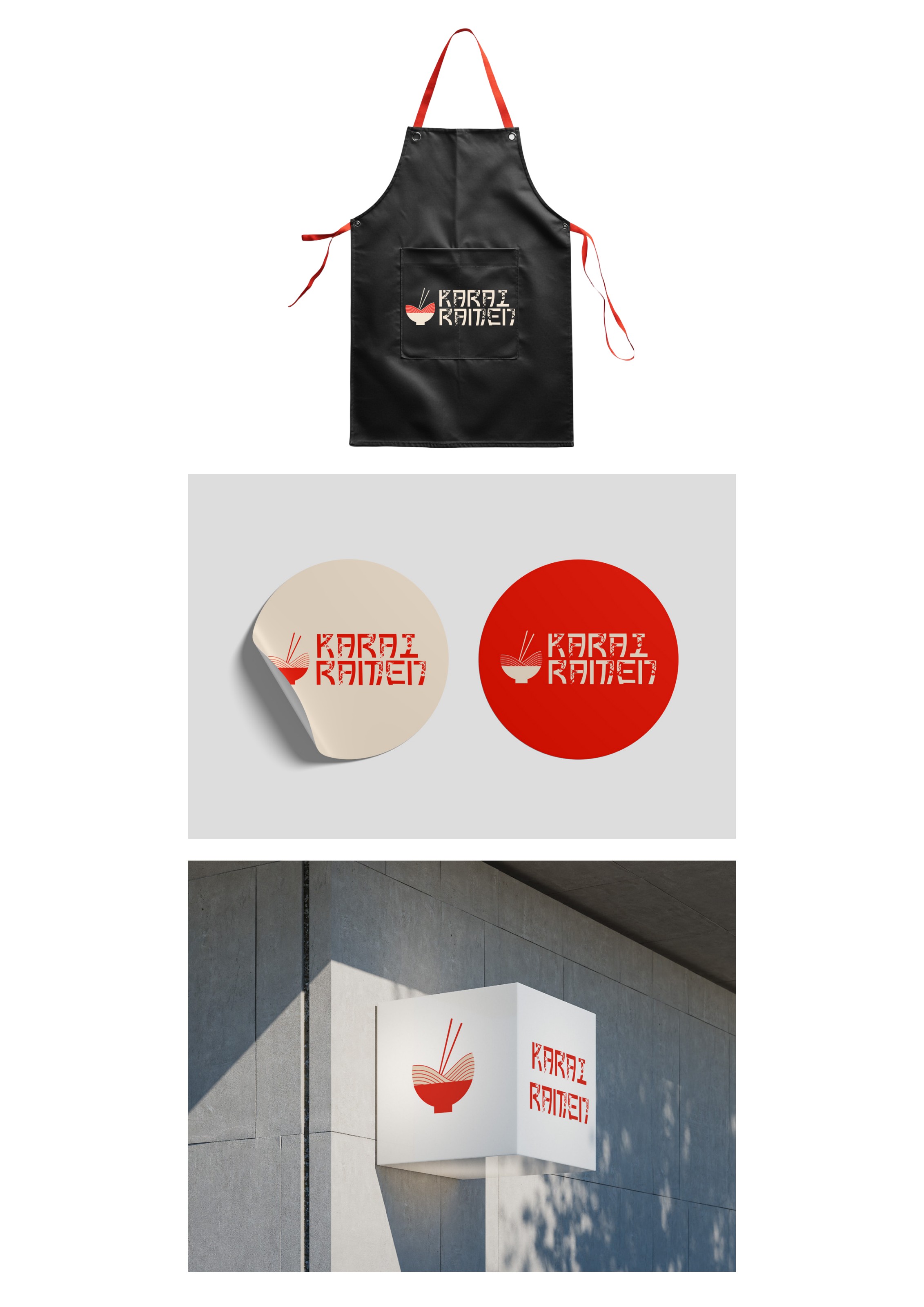
Logo, signage, aprons, stickers and packaging built on the Umami Sans display face.
05
MAKE IT MOVE
Logo animation: steam rises, dragon coils, mark locks up.
06 — FINAL RESULT
Identity for a spicy ramen bar — a dragon hidden inside a noodle bowl.
07
WHAT I LEARNED
The strongest identity decision was subtraction — removing the bowl outline.
LET'S TALK →or go find another project ✦