TYPOGRAPHY ★2025
UMAMI SANS
01 — WHAT WAS THE IDEA?
A sans-serif that tastes like broth — warm, deep, a little salty.
02
THE START
Research into brush calligraphy stroke endings, noren curtains and ramen shop signage. Moodboard was 80% food, 20% type.
keep counters openfat > thinsteam!
03
MAKING IT
Weight experiments from thin to absurdly fat. The fat one won. Rebuilt the counters three times to keep them open.
04
THE DESIGN
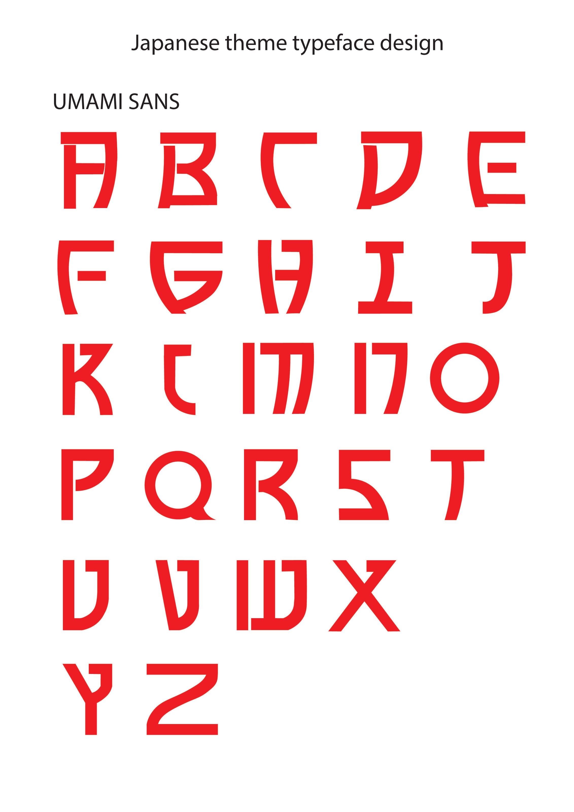
A full uppercase set plus numerals, built for signage, packaging and titles.
05
MAKE IT MOVE
Kinetic type test: letters slurp in from the baseline.
06 — FINAL RESULT
A Japanese-inspired display sans with brushy weight shifts and hungry counters.
07
WHAT I LEARNED
Flavour in type comes from the endings of strokes, not the skeleton.
LET'S TALK →or go find another project ✦